Reading Room 003
Why Everything Has a Beige Logo Now
Register entry
- Classification
- Aesthetic Culture / Commercial Observation
- Collection
- The Reading Room
- Estimated reading time
- 4 minutes
An examination of modern branding’s peculiar relationship with sophistication, restraint, and the apparent dangers of having a personality.
Somewhere, a perfectly respectable shade of purple is being removed from a brand identity.
It has apparently become too expressive.
Too playful.
Too recognizable.
The new identity will be quieter.
More elevated.
More sophisticated.
There will be a minimalist typeface, an abstract symbol, and a presentation explaining how the redesign represents a bold new chapter.
The chapter will be beige.
The Color of Being Taken Seriously
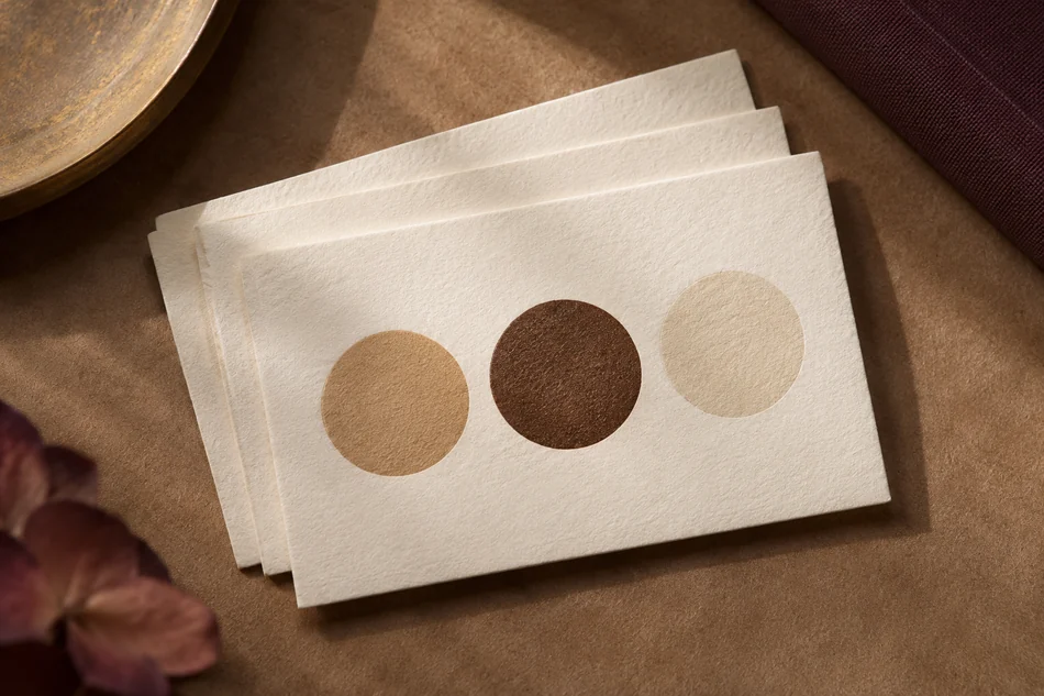
Beige has become a useful shorthand in certain corners of contemporary commercial design.
It suggests calm.
It suggests restraint.
It suggests expensive objects photographed in beautiful lighting.
A beige package can make an ordinary item look considered.
A neutral background can make a product appear luxurious.
A carefully restrained color palette can make even the most unremarkable object seem like it belongs in an architectural magazine.
There is nothing inherently wrong with this aesthetic.
Some of it is beautiful.
The problem begins when restraint becomes so widely imitated that it stops communicating anything distinctive.
A color palette intended to signal originality becomes evidence that the same visual conversation is happening everywhere.
When Luxury Started Whispering
There is an appealing idea behind understated luxury.
Quality should not need to shout.
Materials should speak for themselves.
Beautiful objects should not require excessive decoration.
In the right context, this approach produces exceptional design.
But the visual language of restraint can be copied without reproducing the quality that originally made it compelling.
A beautifully manufactured object and an ordinary mass-produced object can occupy similar beige packaging.
Both may use minimalist typography.
Both may be photographed beside a single sculptural branch.
Both may describe themselves as intentional.
The difference is that one might have something interesting to say.
The other has learned how interesting things are currently photographed.
The Great Personality Reduction
A particularly strange consequence of aesthetic minimalism is the assumption that visual personality becomes less sophisticated as it becomes more expressive.
Bold colors can feel unserious.
Decorative details can seem excessive.
Playful typography can appear unprofessional.
A brand with too much character may be encouraged to simplify.
And simplify.
And simplify again.
Until the remaining identity is a beautiful exercise in not being remembered.
Of course, simplicity is not the enemy.
Some of the most memorable designs in history have been remarkably simple.
The issue is not how many elements a brand contains.
It is whether those elements create a recognizable identity.
A bright red package can be sophisticated.
A deep purple website can feel luxurious.
An unusual typeface can communicate more confidence than an entire presentation about brand values.
Restraint is one design choice.
It is not a universal measurement of taste.
The Strange Economy of Looking Expensive
Visual design also changes how we interpret value.
A product presented in carefully curated surroundings may appear more desirable than the same product photographed without the aesthetic performance.
This is part of what makes branding powerful.
Presentation creates expectations.
But when the visual codes of luxury become widely available, those codes can begin circulating independently of the things they supposedly represent.
A plain ceramic cup becomes an elevated ritual.
A beige notebook becomes an essential object.
A wooden stool becomes an investment in intentional living.
And a bottle of hand soap arrives looking as though it attended architecture school.
Sometimes the product is genuinely exceptional.
Sometimes it is simply very well dressed.
A Small Defense of Visual Personality
Color has always been capable of communicating complexity.
So have ornament, texture, pattern, contrast, and eccentricity.
Expressive design is not automatically cluttered.
Minimalist design is not automatically intelligent.
Luxury does not belong exclusively to muted palettes.
And sophistication does not require every business to dress like the same expensive apartment.
There is room for visual restraint.
There is also room for plum, scarlet, cobalt, emerald, marigold, and every other color currently being asked to wait outside the boardroom.
Perhaps the most luxurious thing a brand can do is develop enough confidence to look unmistakably like itself.
Even if that requires using an actual color.
Museum Observation: Somewhere between elegance and imitation, a remarkable number of brands developed the same personality.